|
VC++ MFC Tree Control:
TVS_CHECKBOXES,TVS_NOTOOLTIPS,TVS_HASLINES,TVS_HASBUTTONS,TVS_SHOWSELALWAYS,TVS_EDITLABELS-MFC-Tree-Control
|
| |
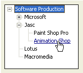
| As
mentioned already, a tree
list is meant to display items in a list
driven by a root and followed by one or more leaves.
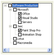
The items are mainly made of text. Optionally, to
display a check box on the left side of the text, set
the Check Boxes property to True or add the
TVS_CHECKBOXES
style (if you are using MSVC 6 and you had added the
Tree Control button to the form or dialog box, open
the resource file as text and manually add this style
because it may not be available on the Properties
window). |
 |
|
To
guide the user with the tree items, the control uses
tool tips. If you will need access to the information
stored in tool tips, set the Info Tip property to True
or add the TVS_INFOTIP
style. If you do not want to display tool tips, set
the Tool Tips property to False or create it with the
TVS_NOTOOLTIPS
style. |
| When a
node has children or leaves, to show this, you may
want to display lines connecting these relationships.
To do this at design time, set the Has Lines
property to True.
If you are
programmatically creating the control and you want to
display lines among related nodes, add the
TVS_HASLINES
style. |
 |
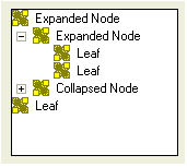 |
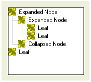
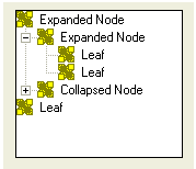
A node
that has dependent children can display or hides them.
To display its leaves, a node must be expanded. To
hide its leaves, a node must collapse. These
operations must be obvious to the user but something
should indicate whether a node has dependent or not.
This can be illustrated by a button that accompany
such a node. To add these buttons to the control, at
design time, set the Has Buttons property to
True. This is equivalent to dynamically creating a
tree list with the
TVS_HASBUTTONS style |
| Unless
you have a reason to do otherwise, it is usually a
good idea to combine both the Has Buttons (or
TVS_HASBUTTONS)
and the Has Lines (or
TVS_HASLINES) styles: |
 |
|
To
show which item is the root, or which items play the
roles of roots, of the tree list, you can display a
line from the root(s) to the child(ren). To do this,
at design time, set the Lines At Root property to True
or add the TVS_LINESATROOT
style. The line from the root(s) to to the child(ren)
can display only if the control has the Has Lines
property set to True or the
TVS_HASLINES style. |
| When
using the list, the user typically selects an item by
clicking it. If you want the mouse cursor to turn into
a pointer finger and to underline the item when the
mouse is over the node, set the Track Select property
to True or create the control with the
TVS_TRACKSELECT
style.
Once the mouse
pointer is on top of the desired item, the user can
click to select it. |
 |
|
When
the user clicks another control or another
application, the node that was selected would lose its
selection as the tree control
would have lost focus. If you want the tree to always
show the selected item even if the control loses
focus, set its Show Selection Always property to True
or create the control with the
TVS_SHOWSELALWAYS style.
Besides selecting an item, when a node has children,
to expand it, the user can double-click the node or
click its button if available. Simply selecting the
node does not expand it. If you want the selected node
to automatically expand without the user having to
double-click or click its button, set its Single
Expand property to True or create it with the
TVS_SINGLEEXPAND
style.
When the items of a tree
control display or when the nodes expand,
they may span beyond the allocated rectangle of the
control. When this
happens, a vertical and/or a horizontal scroll bars
may automatically display. This is because, by
default, the Scroll property is set to True. If you do
not want any scroll bar, set the Scroll property to
False or create the control
with the TVS_NOSCROLL
style.
Another operation the user can perform on a node
consists of changing its text. If you want to allow
this, set the control’s Edit Labels to True or add the
TVS_EDITLABELS
style to it.
A user can be allowed to add items to the list by
drag-n-drop operations. If you want to prevent this,
set the Disable Drag Drop property to True or create
the control with the
TVS_DISABLEDRAGDROP style. |
Next->Tree Control
With Expand node, SetImageList, InsertItem,
NM_CLICK, TVN_ITEMEXPANDING |

 E-XD++Visual
C++/ MFC Products
E-XD++Visual
C++/ MFC Products