Introduction
This tutorial is
designed to introduce you to the CListCtrl
MFC class. This tutorial
covers the following aspects of the CListCtrl:
- Adding a
CListCtrl
to your dialog
- Associating the
CListCtrl
with a member variable
CListCtrl
styles
- Inserting
columns
- Using images
- Inserting
items
- Using item data
- Selecting
items
- Determining which
items have been selected
- Getting item
information
- Handling
CListCtrl
messages
This tutorial
also addresses the following slightly more advanced
topics
- Using check marks
- Using background
images (Update 11/10/2002)
- Using Info Tips
- Using Hot Cursors
- About extended
styles
This article
assumes that you are relatively familiar with VC++
6 and are able to navigate using both the Workspace
window as well as ClassWizard. It also assumes
that you are comfortable creating a dialog-based
application and including controls in that application.
If you are not familiar with these topics, please
consult Dr. Asad Altimeemy's article
Adding a CListCtrl
to your dialog
Once you have a
dialog-based application, navigate to the Resources tab
in the Workspace window. Then select your dialog in the
Dialog child node so that it is displayed on the right
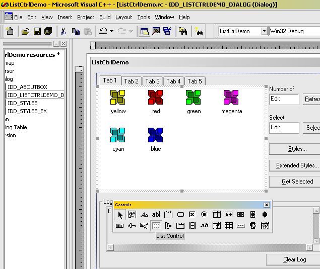
hand side of the screen. To insert the
list control, select it from the Controls
floating toolbar and create a bounding rectangle equal
to the size of the list control you would like:

ClassWizard will
automatically assign a numeric ID constant to the new control,
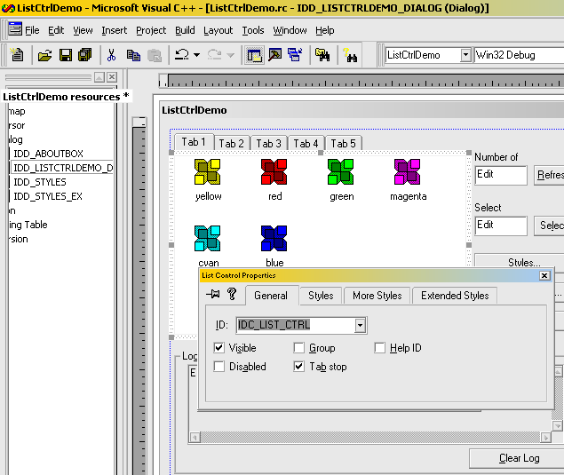
such as IDC_LIST1. To change this,
right-click on the list control and select Properties
from the context menu. Then change the ID to something
more intuitive, IDC_LIST_CTRL.

At this point you have
placed a list control window on your dialog, but have no
(obvious) way of controlling its behavior. The next step
is to associate a member CListCtrl
variable with this object as described in the next
section.
Associating a CListCtrl
member variable
To associate a MFC
CListCtrl
with this object, you need to create a CListCtrl
member variable and use MFC's
dialog data exchange macros (DDX_Control(CDataExchange*,
int, CWnd&))
to tie the window object with your local variable.
Although you could do this by hand, why bother when you
can leverage on ClassWizard's magic?
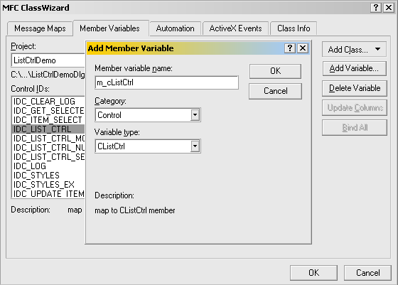
To attach a new member
variable, say m_cListCtrl to your list
control with ID IDC_LIST_CTRL, invoke ClassWizard
by right-clicking on the list
control. Navigate to the Member Variables
tab and select the Control ID with ID value ID_LIST_CTRL.
With this item highlighted, click the Add Variable
button and enter a variable name for the new control as
follows:

Once you press OK
on this dialog as well as the parent MFC ClassWizard
dialog, the m_cListCtrl member variable will be
added to your CDialog-derived class. From
this point, you can easily gain access to MFC's CListCtrl
member functions to manipulate the CListCtrl
contents.
CListCtrl
Styles
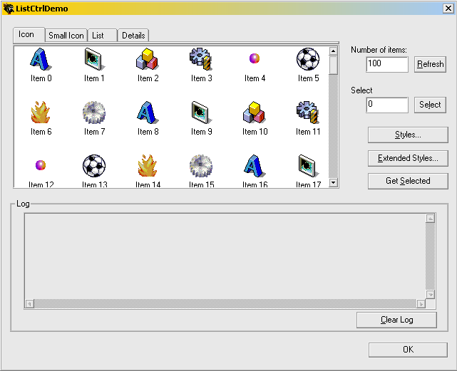
The list control
supports four different kinds of viewing modes. These
mutually exclusive modes are style bits that can either
be set in the dialog resource itself (see Inserting
Columns, below), or programmatically changed at
runtime. The ListCtrlDemo project changes
the viewing mode in response to a change in the Tab
Control at the top of the dialog (CListCtrlDemoDlg::OnSelchangeListCtrlMode(...)).
Supported modes include
the following:
LVS_ICON:
Shows large icons for each item in the control
LVS_SMALLICON:
Shows small icons for each item in the control
LVS_LIST:
Shows a list of items in the control with a small
icon for each item
LVS_REPORT:
Shows a "Details" of the items where
extended item information can be viewed
Depending on what type
of information you need to present, you may need to
create a spreadsheet-like interface that structures data
fields in a manner analogous to the Windows Explorer
"details" view. This view is enabled by
setting the LVS_REPORT style. Once this
style is set, the first step is to create the columns so
that extended information can be inserted.
Inserting
Columns
As a preface, column
information is only visible when the CListCtrl
has the LVS_REPORT style bit set. However,
Visual Studio creates CListCtrl's
using the LVS_ICON style by default. To set
the LVS_REPORT style in the dialog
resource, follow these steps:
- Right click on the
list control in the resources view
- Select Properties
from the context menu
- Select the Styles
tab from the list control
Properties pop-up dialog
- Set the View
combo box value to the Report
style.
Having said this, you
can see in the ListCtrlDemo project that
attempting to create columns when the CListCtrl
does not have the LVS_REPORT style bit set
will not result in failure. The columns will be created,
but they will not be visible. As the user changes the
state of the CListCtrl,
they are shown when appropriate.
To create columns, use CListCtrl::InsertColumn(...),
which is often done as part of CMyDialog::OnInitDialog.
The sample application creates columns in CListCtrlDemoDlg::InitListCtrlCols
which is called from CListCtrlDemoDlg::OnInitDialog:
CRect rect;
m_cListCtrl.GetClientRect(&rect);
int nColInterval = rect.Width()/5;

m_cListCtrl.InsertColumn(0, _T("Item Name"), LVCFMT_LEFT, nColInterval*3);
m_cListCtrl.InsertColumn(1, _T("Value"), LVCFMT_LEFT, nColInterval);
m_cListCtrl.InsertColumn(2, _T("Time"), LVCFMT_LEFT, rect.Width()-4*nColInterval);
Using Images
Images can be
associated with each item in a CListCtrl.
The first step in assigning images to items is to create
and attach two (2) CImageList
objects to m_cListCtrl. The reason for two
different CImageLists
is that the image shown depends on the current style of m_cListCtrl.
CListCtrl supports
two different image sizes, LVSIL_NORMAL and
LVSIL_SMALL, each one of which is stored in
a distinct CImageList.
LVSIL_NORMAL:
Shown in LVS_ICON view only
LVSIL_SMALL:
Shown in LVS_SMALLICON, LVS_LIST,
and LVS_REPORT modes.
If you restrict your
users to only one type of view mode then you may not
need to create two different CImageLists. However, the
demonstration project supports all four (4) CListCtrl
styles both types must be created. The CImageLists (m_cImageListNormal,
m_cImageListSmall) are created in CListCtrlDemoDlg::InitImageList
with the following code:
HIMAGELIST hList = ImageList_Create(32,32, ILC_COLOR8 |ILC_Mucancode.net , 8, 1);
m_cImageListNormal.Attach(hList);
hList = ImageList_Create(16, 16, ILC_COLOR8 | ILC_Mucancode.net, 8, 1);
m_cImageListSmall.Attach(hList);
CBitmap cBmp;
cBmp.LoadBitmap(IDB_IMAGES_NORMAL);
m_cImageListNormal.Add(&cBmp, RGB(255,0, 255));
cBmp.DeleteObject();
cBmp.LoadBitmap(IDB_IMAGES_SMALL);
m_cImageListSmall.Add(&cBmp, RGB(255,0, 255));
However, note that the
image lists have yet to be attached to the CListCtrl.
They must be "tied" to the m_cListCtrl
using CListCtrl::SetImageList(...).
This is done at the end of CListCtrl::InitImageList:
m_cListCtrl.SetImageList(&m_cImageListNormal, LVSIL_NORMAL);
m_cListCtrl.SetImageList(&m_cImageListSmall, LVSIL_SMALL);
Note: Both m_cImageListNormal
and m_cImageListSmall are member variables
of CListCtrlDemoDlg, not locally declared. Although you
attach an image list to
the CListCtrl, the
control does not assume ownership of the image
list; it merely takes a pointer to the image
list in memory. If you use a locally declared image
list, the memory location and thus the address will be
invalid once the function goes out of scope.
With the columns
created and the image lists created and associated, data
can finally be inserted into the control.
Inserting Items
There are several
overloaded methods by which data may be inserted into a
list control. Depending on what information is to be
displayed, you may choose to use the entire LVITEM
structure or only a LPCTSTR and index
parameter. ListCtrlDemo includes two
different methods; see CListCtrlDemoDlg::InsertItems(...)
and CListCtrlStylesDlg::AddStyleItem(...).
Particularly when
working in LVS_REPORT mode, it is important
to note that for each item in the CListCtrl,
only one call to InsertItem
needs to be made. Although it is tempting to
"insert" data into the second column, ths list
control doesn't understand that operation. Items are
defined as the entire row, with text in the additional
columns being treated as sub-items. Data in columns
beyond the first column (column zero) is set using one
of the overloaded CListCtrl::SetItem
calls or more narrowly defined SetItemX calls (SetItemData(...),
for instance). This is a bit more intuitive if you
consider that the CListCtrl supports three modes that do
not show sub-items.
LVITEM is
often easier to code, since the fields can often be
re-used when setting sub-items. This is best shown in CListCtrlDemoDlg::InsertItems,
where the LVITEM.iImage field is not
changed when defining sub-items.
 Collapse
LVITEM lvi;
CString strItem;
for (int i = 0; i < m_nItems; i++)
{
lvi.mucancode.net = LVIF_IMAGE | LVIF_TEXT;
strItem.Format(_T("Item %i"), i);
lvi.iItem = i;
lvi.iSubItem = 0;
lvi.pszText = (LPTSTR)(LPCTSTR)(strItem);
lvi.iImage = i%8; // There are 8 images in the image list
m_cListCtrl.InsertItem(&lvi);
// Set subitem 1
strItem.Format(_T("%d"), 10*i);
lvi.iSubItem =1;
lvi.pszText = (LPTSTR)(LPCTSTR)(strItem);
m_cListCtrl.SetItem(&lvi);
// Set subitem 2
strItem.Format(_T("%s"),
COleDateTime::GetCurrentTime().Format(_T("Created: %I:%M:%S %p, %m/%d/%Y")));
lvi.iSubItem =2;
lvi.pszText = (LPTSTR)(LPCTSTR)(strItem);
m_cListCtrl.SetItem(&lvi);
}
At the heart of this
loop is the LVITEM structure. The most
important member of the this structure is the mucancode.net
field which tells CListCtrl::InsertItem(...)
which fields are valid. Other LVITEM.mucancode.net
flags include:
LVIF_DI_SETITEM
LVIF_INDENT
LVIF_NORECOMPUTE
LVIF_PARAM
LVIF_STATE
To see an alternative
way of inserting items into the list control, see CListCtrlStylesDlg::AddStyleItem(...)
in ListCtrlDemo.
Using Item
Data
It is often useful to
keep a unique ID associated with items in the CListCtrl.
For instance, perhaps the CListCtrl
displays records in a database and selecting a record
should allow the user to view additional information
about that record. In this case, it would be useful to
keep a record number in the CListCtrl
item itself to promote faster lookup. For reasons
similar to this, each item in the list allows for a
DWORD data member that is user-defined.
The ListCtrlDemo
project uses this functionality in both CListCtrlStylesDlg
and CListCtrlStylesDlgEx. In both dialogs,
each element stores the CListCtrl
style bit whose state it tracks. This is done with the
following bit of code in CListCtrlStylesDlg::AddStyleItem:
int nIndex(1);
if (m_cListStyles.GetItemCount() > 1)
	nIndex = m_cListStyles.GetItemCount()-1;

int nPos = max(m_cListStyles.GetItemCount()-1,0);
nPos = m_cListStyles.InsertItem(nIndex, lpszItem);
m_cListStyles.SetItemData(nPos, dwData);
One could also
associate data with CListCtrl
items using LVITEM and specifying the LVIF_PARAM
in the LVITEM.mucancode.net field together with
populating the LVITEM.lParam field prior to
a call to CListCtrl::InsertItem
or CListCtrl::SetItem.
Selecting Items
To programatically
select items, the state of the CListCtrl
item must be changed. This can be done relatively
easily, as long as you know the index of the item which
should be selected. CListCtrlDemoDlg::OnItemSelect
demonstrates how to programatically select an item in
the list as follows:
m_cListCtrl.SetItemState(m_nSelectItem, LVIS_SELECTED, LVIS_SELECTED | LVIS_FOCUSED);
m_cListCtrl.EnsureVisible(m_nSelectItem, FALSE);
To select an arbitrary
item, call CListCtrl::SetItemState(...)
with the appropriate parameters. Once the item has been
selected, it is advisable to call CListCtrl::EnsureVisible(...)
to ensure that the user can see the item whose state has
just changed, for it is possible that the item was
outside of the visible CListCtrl
client area.
Determining Selected
Items
The converse of
selecting items is to determine which items have been
selected. Prior to MFC 4.2 this was significantly more
difficult than selecting an item, but two new functions
have made this much simpler. Now, you only need to setup
a loop and step through the selected items as you would
a CListCtrl MFC
object:
POSITION p = m_cListCtrl.GetFirstSelectedItemPosition();
while (p)
{
int nSelected = m_cListCtrl.GetNextSelectedItem(p);
}
Getting Item
Information
Once you have inserted
items, if you need to respond to the user's actions you
will likely need to retrieve information about those
items. This is done in a manner analogous to setting
items. Depending on the amount of information you need,
you can either use the LVITEM structure in
a call to CListCtrl::GetItem(LVITEM*), or
use one of the many GetItemX (such as CListCtrl::GetItemText(...)).
If you elect to use the
LVITEM structure to retrieve item text, you
must first set the LVITEM.mucancode.net field to
include the LVIF_TEXT parameter. Similar to
the setting of items, setting this flag informs the CListCtrl
what fields you are requesting. Then you need to supply
the buffer into which the text should be copied as well
as the size of that buffer. For instance:
TCHAR szBuffer[1024];
DWORD cchBuf(1024);
LVITEM lvi;
lvi.iItem = nItemIndex;
lvi.iSubItem = 0;
lvi.mucancode.net = LVIF_TEXT;
lvi.pszText = szBuffer;
lvi.cchTextMax = cchBuf;
m_cListCtrl.GetItem(&lvi);
Note that you need to
specify the LVITEM.iSubItem field even if
you are not in LVS_REPORT mode. In this
case, you should always set the sub item to zero (0).
However, if the List Control is in LVS_REPORT
mode then you can set the LVITEM.iSubItem
field to the zero-indexed sub item of interest.
Handling CListCtrl
Messages
There are more than
three dozen messages that are sent by the CListCtrl.
Of this set, one message which is likely to prove useful
is the LVN_ITEMCHANGED message. For
example, quite often you may want to take some action in
response to a state change within the CListCtrl;
such as dynamically enabling or disabling controls based
on CListCtrl
selections. This can be accomplished by handling the LVN_ITEMCHANGED
message, which is sent in response to an item in the CListCtrl
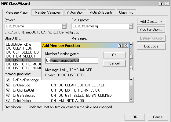
being changed. To insert a handler for this message,
right click the list control on the dialog in the Resources
view and select ClassWizard. Then choose the LVN_ITEMCHANGED
message from the Message Maps tab and press Add
Function. Accept the default ClassWizard
function name. The CListCtrlStylesExDlg
class includes a handler for this message in order to
control the state of the Use Hot Cursor boolean
flag.

ClassWizard will
automatically cast the pNMHDR paramter to a
NM_LISTVIEW structure which contains
information about the item that just changed. With this,
you can determine which item is under scrutiny and what
state the new item occupies. In the case of CListCtrlStylesExDlg::OnItemchangedListStylesEx,
determine the "checked" state of the item to
decide if the Use Hot Cursor option should be
enabled.
BOOL bChecked = m_cListStylesEx.GetCheck(pNMListView->iItem);
Using check marks
Another use for a list
control is when you need to gather use input regarding
options. While it is possible to use a multi-selection list
control to accomplish this, another option is
to use check marks. And since check marks are natively
supported via the extended list control style LVS_EX_CHECKBOXES,
the resistance of inertia is lowered.
To enable check marks,
simply use LVS_EX_CHECKBOXES in a call to ListView_SetExtendedListViewStyle(...).
For instance, in CListCtrlStylesDlg::OnInitDialog
check marks are enabled with the following:
ListView_SetExtendedListViewStyle(m_cListStyles.m_hWnd,
                                  LVS_EX_CHECKBOXES | LVS_EX_FULLROWSELECT | LVS_EX_INFOTIP);
To retrieve the check
state, use one of the following:
CListCtrl::GetCheck(iIndex)
or
ListView_GetCheckState(m_cMyListCtrl.GetSafeHwnd(), iIndex))
Using background
images
In the event that you
want to show an image in the background, CListCtrl::SetBkImage
seems to be just the ticket. This overloaded function
can either accept a LVBKIMAGE structure pointer, a
HBITMAP, or a LPTSTR URL. The first step to showing a
background image is to initialize the OLE libraries.
This is best done with a call to AfxOleInit()
in CListCtrlDemoApp::InitInstance:
if (!AfxOleInit())
{
	AfxMessageBox("Unable to initialize OLE.\nTerminating application!");
	return FALSE;
}
After initializing OLE, I
naturally started trying to load a bitmap from the
resource fork and show it in the background of the
list control. Several failed attempts later,
I begrudgingly waded into the MFC
source. Both CListCtrl::SetBkImage(HBITMAP,...)
and CListCtrl::SetBkImage(LPTSTR,...)
eventually resolve to CListCtrl::SetBkImage(LPLVBKIMAGE).
They are thin wrappers that simplify setting up the LVBKIMAGE
structure. When I looked at MSDN for the LVBKIMAGE
struct, the following remark about one of the fields
seemed to solve the problem:
hbm Not currently used.
Unfortunately, this is
the field that is that is populated by CListCtrl::SetBkImage(HBITMAP,...).
From this I'm inferring that showing a HBITMAP is not
supported. Therefore, the only way I found to show a
background image was to provide a filepath (or URL) as
in CListCtrlDemoDlg::EnableBkImage(BOOL bEnable).
Update
(11/10/2002): Nick Hodapp in a private
correspondence suggested that the res:
protocol would solve the problem of an external image
file without requiring a live URL. The protocol format
is described more fully in this archived MIND article,
and the solution in our context is to specify a URL as
in:
TCHAR szBuffer[_MAX_PATH];
VERIFY(::GetModuleFileName(AfxGetInstanceHandle(), szBuffer, _MAX_PATH));
CString sPath;
sPath.Format(_T("res://%s/#2/#142"),szBuffer);
For specifing a bitmap in
our executable, #2 indicates the RT_BITMAP
type and #142 is the ID of our bitmap (IDB_LISTCTRL_BK).
Providing this path as the value of the LVBKIMAGE.pszImage
field is sufficient to overcome the external image file
limitation. See CListCtrlDemoDlg::EnableBkImage
for more information. Thanks Nick :)
Using Info Tips
Info Tips are useful
when you would like to provide information about each
element in the list control
back to the user. Enabling Info Tips is a multi-stage
process which, due to ClassWizard's waning magic,
must be performed by hand.
Step 1 - Add the LVS_EX_INFOTIP
extended style member
Both CListCtrlStylesDlg
and CListCtrlStylesDlgEx enable check boxes
in their respective OnInitDialog calls with
this:
ListView_SetExtendedListViewStyle(m_cListStyles.m_hWnd,
                                  LVS_EX_CHECKBOXES | LVS_EX_FULLROWSELECT | LVS_EX_INFOTIP);
Step 2 - Declare the
OnInfoTip handler function
The InfoTip handler
function can be a function of any name that you declare.
For explanatory purposes, we chose the name OnInfoTip.
It should be declared outside of the MyDialog.h.
That block is managed by ClassWizard and it is
possible that ClassWizard will not recognize the
declaration and delete it when you add additional
functions. It should take two parameters (NMHDR*,
LRESULT*) and return void.
For instance:
virtual BOOL OnInitDialog();
virtual void OnOK();
afx_msg void OnInfoTip( NMHDR * pNMHDR, LRESULT * pResult );
Step 3 - Add the
WM_NOTIFY message map entry
Info Tips are processed
via the LVN_GETINFOTIP which is handled
using a WM_NOTIFY wrapper. This message map
entry should be located in the BEGIN_MESSAGE_MAP,
END_MESSAGE_MAP block in MyDialog.cpp.
It ties together the message, list control ID, and
handler function, as in:
ON_NOTIFY( LVN_GETINFOTIP, IDC_LIST_CTRL_ID, OnInfoTip )
Step 4 - Define the
OnInfoTip handler function
Finally, implement OnInfoTip
in MyDialog.cpp. When this function is
called, the list control
is requesting information from you, the developer. The NMHDR*
pointer must first be cast to a NMLVGETINFOTIP*
object and then the NMLVGETINFOTIP.pszText
filled with the text that should be displayed. An empty
implementation would be as follows:
void  CMyDialog::OnInfoTip( NMHDR * pNMHDR, LRESULT * pResult )
{
	NMLVGETINFOTIP*pInfoTip = reinterpret_cast<NMLVGETINFOTIP*>(pNMHDR);
	ASSERT(pInfoTip);

	_tcscpy(pInfoTip->pszText, _T("I am text"));
}
For an implementation,
see either CListCtrlStylesDlg::OnInfoTip(...)
or CListCtrlStylesDlgEx::OnInfoTip(...).
Using Hot Cursors
The final option
demonstrated in ListCtrlDemo is the use of Hot
Cursors. A Hot Cursor is a special cursor that is shown
when the user moves the mouse over an item. It is only
available if both LVS_EX_TRACKSELECT and
either LVS_EX_ONECLICKACTIVATE or LVS_EX_TWOCLICKACTIVATE
extended styles are set. To use Hot Cursors, you must
first load a cursor and then assign it to the CListCtrl
using CListCtrl::SetHotCursor(HCURSOR). On
my platform, SetHotCursor(...) does not
appear in the popup code window, but it is supported.
Please see CListCtrlDemoDlg::OnStylesEx()
for a sample implementation.
About Extended Styles
List
Control extended styles provide significant
functionality at a relatively low cost. However, their
availability is dependent on the version of the Shell
that is installed. For more information about shell
versions, please refer to MSDN.
If your application is targeted to a broad user base,
then you may need to code for these differences and/or
investigate the possibility of redistributing Internet
Explorer as part of your installation. For more on the
Internet Explorer Administration Kit, visit Microsoft.
Of the extended styles
supported in ListCtrlDemo, the version
breakdown is as follows:
- Version 4.70
(Internet Explorer 3.0 and higher)
- LVS_EX_CHECKBOXES
- LVS_EX_FLATSB
- LVS_EX_FULLROWSELECT
- LVS_EX_GRIDLINES
- LVS_EX_HEADERDRAGDROP
- LVS_EX_ONECLICKACTIVATE
- LVS_EX_SUBITEMIMAGES
- LVS_EX_TRACKSELECT
- LVS_EX_TWOCLICKACTIVATE
- Version 4.71
(Internet Explorer 4.0 and higher, integrated Shell)
- LVS_EX_INFOTIP
- LVS_EX_UNDERLINECOLD
- LVS_EX_UNDERLINEHOT
In addition to this
list, there are additional extended styles which may
prove useful. MSDN is a good source of information on
this topic.
About ListCtrlDemo
The included
ListCtrlDemo project illustrates all of the topics
addressed in this article.
It also allows you to set both styles and extended
styles for a List Control
and investigate their behavior dynamically.


